Showing posts with label Germany. Show all posts

5.27.2017

GRUNDEMARK NILSSON GALLERY: Free of Immediacy


© ARTISTS, ALL RIGHTS RESERVED

© ARTISTS, ALL RIGHTS RESERVED

"Free of Immediacy" exhibition shows the photographic works of Matan Mittwoch (born in 1982, Israel) in combination with an installation by Royden Rabinowitch(born in 1943, Canada), curated by Ory Dessau.

The exhibition Free of Immediacy seeks to bypass the basic notions underlying the canon of modernist abstraction, i.e., the idea of a direct, unmediated visual experience within an isolated field of vision. The exhibition seeks to prevail beyond the level of appearance, visibility, and form; beyond the confinements of human observation. It relates to the world in quantitative-calculative terms to undermine the totality of subjective expression and perception; yet, while disconnecting the empirical description of the world from direct experience, the exhibition also establishes an unfamiliar ground for cultural pluralism, for self- and collective-relativity. The exhibition does not pretend to be a summary of current tendencies in the contemporary art scene, but to be a preliminary outline, a proposal of a proposal.
 
GRUNDEMARK NILSSON GALLERY
BERLIN / STOCKHOLM
WWW.GRUNDEMARKNILSSON.SE

GRUNDEMARK NILSSON GALLERY
LINDENSTRASSE 34, 
10969 BERLIN, GERMANY

GRUNDEMARK NILSSON GALLERY
 SIBYLLEGATAN 26, 
114 42 STOCKHOLM, SWEDEN

1.15.2014

TOD PAPAGEORGE: Studio 54, 1978-1980

Studio 54, 1978-1980
Photograph (c) Tod Papageorge /All Rights Reserved
• Click Images To View Enlarged Portfolio •

Studio 54, 1978-1980
Photograph (c) Tod Papageorge /All Rights Reserved

Studio 54, 1978-1980
Photograph (c) Tod Papageorge /All Rights Reserved

Studio 54, 1978-1980
Photograph (c) Tod Papageorge /All Rights Reserved

Galerie Thomas Zander presents its first exhibition of works by the American photographer Tod Papageorge. On view is a series of seventy black and white photographs from the legendary New York night club Studio 54, that was frequented by the likes of Andy Warhol, Liza Minnelli, Mick Jagger and Grace Jones. Papageorge always had his camera at hand and between 1978 and 1980 he celebrated with the rich and beautiful, the artists and starlets; even today viewers can witness the eccentric and hedonistic party nights in his photographs. They revive the feeling of the disco era and express a profoundly urban spirit of directness, which condensed in New York at that time.

In the 1960s, Tod Papageorge had a close artistic exchange with Garry Winogrand. Both artists used to meet almost daily to take photographs in the streets of New York. During those days, some icons of photography history originated, which with their intuition and intensity exude a unique kind of lightness. As a recipient of two Guggenheim Fellowships and a teaching professor at Yale University for many years, Papageorge’s influence on contemporary photography can hardly be overestimated.

Renowned photographers like Philip-Lorca diCorcia, Gregory Crewdson, or Anna Gaskell were among his students. All of Tod Papageorge’s works are based on an interest in people as social beings. Be it his images of sports stadiums, his photographs of everyday life in Central Park or the images from Studio 54, in all his photographs people are characterized through the group they belong to and their experience of the present moment. His works are intense portraits of America marked by a powerful authenticity. (text courtesy of Galerie Thomas Zander)

January 25 – April 12, 2014
Galerie Thomas Zander
Schönhauser Str. 8, 50968 Köln, Germany

8.24.2013

CHRISTOPH KLAUKE | DOUBLE PORTRAITS

 Double Portraits  
Photograph (c) Christoph Klauke

Double Portraits  
Photograph (c) Christoph Klauke

Double Portraits  
Photograph (c) Christoph Klauke

Double Portraits  
Photograph (c) Christoph Klauke

German born Photographer Christoph Klauke, based in London, received his Bachelor of Arts degree from Brooks Institute of Photography in California. Over the years Klauke has gone on to work for many publications, including The New York Times Magazine, French Vogue and Vanity Fair, as well as solo exhibitions in London, Paris, Tokyo, Basel and Lugano.

His first book, The 28 Faces of Corinne Dolle, was published in 2011. I spoke with him recently about the upcoming launch in London of his second book, Double Portraits.
 +  +  +

EA: How long have you been working on your series, Double Portraits?

CK: I started Double Portraits with the intention of making a portrait photo book in early 2000. I had my own photo studio then, in an up-and-coming area of London called Spitalfields. After relocating to New York in the summer of 2001, I continued with the portraits in New York until 2004 and finally finished a third chapter on the West Coast in 2005. On returning to  London I thought I would be able to place the project with one of the specialist publishers but it proved impossible. I self-published my first photo book two years ago, as a form of trial run for the "Double Portraits" book.  I would recommend to other photographers to do the same. Although painful at times, it is incredibly rewarding to stay in control of the book production process.

EA: Are these portraits identical?

CK: No, the portraits are similar but not identical. There is a time lag of several seconds between the first exposure, the left photograph and the second exposure, the right photograph. All these portraits were taken with an 8x10" Deardorff camera, which requires using a heavy tripod. The left frame is focused and composed, the second is uncontrolled. The sitter knows that I am taking two pictures and is attempting to sit still. Since the depth of field in this close up setting is so shallow, there is inevitably some movement or at least a different expression in the second photograph. Combined together, the viewer's eye scans for differences and sometimes feels or imagines the moment in between.

EA: How did you arrive at this idea?

CK: Back in Spitalfields, in 1999, I was asked to exhibit in a small space, a former tailor's shop called "Made to Measure" in a Georgian house in Princelet Street.  I did a series of sittings with a local beauty and neighbor, and the first double portraits evolved. The images had to be printed large scale since the work could only be viewed from the street through the shop front window. Today, I am much happier working with small prints, closer to life size. 

EA: How large are the actual prints?

CK: The image size is 8 1/2 x 11" on 9 x12" Agfa paper, so just a minimal enlargement from the 8 x 10" size of the camera negative. The hand prints were made by Brian Dowling in London, close to the time of the sittings. Our intention was to produce a master set of reproduction prints for this book. Other than this set, I have a couple of spare prints of each image and that's it. We had no idea at the time of printing that the paper would disappear soon after. Agfa went bust and Kodak, which made the second most suitable paper stock, also stopped making the paper. It's worth mentioning that the photographs are reproduced 8x10" in size in "Double Portraits"; this is a homage to the 8x10" negative format.

EA: Who was involved with the making of this book?

CK: Stephen Male did the edit and sequencing of "Double Portraits", so when I met with Leon Krempel, I had a dummy with blind text in hand. It was suggested that I approach him with a view to writing the introduction because Krempel had curated and put together a very interesting exhibition and book called "Marlene Dumas: Tronies," where he contrasted historical paintings by the Dutch Masters with contemporary paintings by Marlene Dumas. Tronies are small, isolated paintings of heads. While a rigorous art historian interested in portraiture, Krempel was able to convey what the photographs feel like, as opposed to what they look like.

EA: The book has beautiful design details. Can you tell me a little about the printing, paper and binding?

CK: Lena Mahr is responsible for many of these details. She finished the book design based on the initial design direction by Stephen Male with great diligence. The book was printed by Optimal, one of the top printers in Europe. The paper we used is 115g/m2 Phoenix Motion by Xantur. In Germany the binding we used is called "Japanese binding", but I believe in English it is either known as pouch binding or French binding. Another term for the binding is Japanese fore-edge fold. Besides the obvious advantage of printing only on one side of the paper and having no 'show through', the pages lie almost perfectly flat when opened and don't close on themselves. I have to give the printer credit for this suggestion. It made a big difference for this project.

EA: Your book launch will be September 4th (at Claire de Rouen Books) in London. Any other future plans for this series?

CK: The "Double Portraits" book is really the finished work. There are only 750 books printed and all are numbered.  I would like to produce a sequel, which would involve spending a year or so in Africa, Asia and India, but this would require external funding. And who knows if Kodak survives. One day soon there may not be any film left to take these kinds of photographs.


ChristophKlauke.com

"The first portrait of each pair results from a carefully-established relationship between photographer and sitter. The second shot is taken a moment after the first, capturing the consequences, in the sitter, of becoming a ‘subject’. Sometimes these second portraits show us what León Krempel calls ‘sundered egos'. All of them describe the passing of time and, as such, allude to the way in which portraiture aspires to posterity."
  
  
Double Portraits. Photographs Christoph Klauke

A Limited Edition Hardcover. 156 pages, 56 photographs
First Edition, 750 numbered copies
Contact: Eudora Pascall: 44 (0) 7900 568 745
doubleportraits@gmail.com

DoublePortraits.com

3.15.2011

ELISABETH BIONDI: La Lettre Interview

Elisabeth Biondi in her Conde Nast office
Photograph by Enrico Bossan

The wall in Biondi's New Yorker office
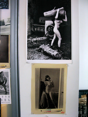
Helmut Newton photograph above Diane Arbus: "Helmut was so German and this picture is so German. It’s one of my favorites. I grew up in the woods. Only a German can make this picture."

Newton and Avedon on Biondi's New Yorker wall

A photograph is an entity. You don’t crop it, you don’t butcher it, you don’t plaster text over it, you treat it with dignity.– Elisabeth Biondi

Elisabeth Biondi has left an indelible impression on all of us throughout her powerful career at four of the most influential magazines in the world. Biondi joined The New Yorker Magazine as Visuals Editor in 1996, just a couple of years after photography had first been introduced into the three quarters of a century old magazine. From her extensive background at Geo, Stern, and Vanity Fair, she brought her masterful eye to The New Yorker, helping to build their reputation for their award winning use of photography.


I spoke with Ms. Biondi in her Condé Nast office, above Times Square:


FROM GERMANY / TO AMERICA

I left my village in Germany when I was 19. It was a small village, only forty-two houses, two hundred people and four hundred cows. I went to Paris, and then London as an au pair girl. I didn’t really study photography. I was ready to leave Germany and looking to immigrate somewhere. You could go to Australia, South Africa, or Canada if you paid 200 marks, which is about $50.00, and commit yourself to stay in the country for a period of time. They were looking for immigrants, especially Germans, for some reason. I asked for the forms and I was debating where I was going to go. Canada was too cold for me, South Africa had political problems and Australia didn’t really entice me. I was going to do one of those three, when I met my American husband in Frankfurt while I was working for Lufthansa.


We stayed for a year in Germany after we had married, then we came to New York. He worked as an assistant Art Director at London Records. I wanted a job, so he said there’s this job in a photo studio and I went to interview. It was just a little studio with staff photographers. We produced shoots, a 'stock' library, and carried out assignments. It was a very different time, the late 1960’s, early 1970’s. Our photography studio produced magazine covers; they did assignments, anything and everything. I was the assistant to the man who ran the company and I got my basic training how this was done. At some point while working there, I decided I wanted to work for magazines, and I wanted to be a Picture Editor.


PICTURE EDITOR / GEO MAGAZINE

I went to a magazine to get the experience - I don’t want to reveal the name - then I waited until I found a magazine that interested me. German Geo decided to have an American magazine on the American market. It was supposed to be a more contemporary National Geographic and modeled after the very successful German Geo. With the combination of my being German, and now having the title ‘Picture Editor’, which I really wasn’t, I was hired as the assistant Picture Editor. Alice George was the Picture Editor. There was a big upheaval at the magazine fairly early on and I was named Picture Editor. When I joined the staff of Geo I was divorcing, it was an emotional time for me and Geo became my home.


At Geo, Thomas Hoepker was the Executive Editor, in charge of visuals and layout. He is a Magnum photographer now, and my training came from him. I learned from a photographer, and certain basic understandings or rules, if you want, from this time have stayed with me my entire work life; “A photograph is an entity. You don’t crop it, you don’t butcher it, you don’t plaster text over it, you treat it with dignity. You look at it as important as you treat words. It has different properties to it, but it isn’t simply an illustration.”


It was the Magnum time. The premise was, photographers would be sent off for three or four weeks to tell a story with or without a writer, to photograph a story. They would come back and make a presentation to us. We would make an edit and then the visual treatment to the magazine would be put in layout. In some way, the visual treatment was as important, if not more important, than the text. In the beginning, it was more photography driven. Over the years, it changed. In the end, it became more like a travel magazine but the initial premise was not unlike National Geographic-- that you could tell stories in the photographs. In our first issue, we did the Badlands. It was more than thirty pages of exceptional photography. Usually we published six stories -- some were large, some slightly less, but it was always a sumptuous display of good photography.


FROM GEO / TO VANITY FAIR

Vanity Fair was then edited by Tina Brown. It was the early years, it wasn't successful yet. She had already been there for two years and Annie

(Leibovitz) was already present at the publication. Vanity Fair was very different from many other publications---basically Tina didn’t make a

judgment between words and pictures. Whatever was interesting, or as she would say, “Hot. Hot. Hot. Hot. Hot!”, got more space and was promoted.


Certainly there were the important word pieces, but photos were important too, and they contributed to it’s success. I would say there was a Vanity Fair style of photography, particularly portrait photography. I think Annie was a big part of that, and it helped make Vanity Fair successful. One of the early success’s was Harry Benson photographing the Reagan’s in the White House dancing. That was a coup and was noticed. And then of course Helmut (Newton) shooting Claus von Bülow, which was much talked about.

I was there for seven years. It was time for a change. I moved back to Germany and went to Stern.


RETURN TO GERMANY / STERN MAGAZINE

From 1968-1996, I was in the U.S. exactly 23 years. I came when I was 23, and I went back when I was 46. Half my life was spent here and half my life was spent there. I really had not kept up with my German life. I came here to immerse myself in all things American and I stayed away from everything German. And it was hard, it was really difficult being in Germany, working for a big fat weekly, because before I didn’t read in German, I didn’t know German politics anymore, I didn’t know German TV. When I was in the U.S. I didn’t see Fassbinder, just to illustrate how much I had focused on giving up my past. German popular culture was alien to me, it was all an enormous challenge. But in the end, I reconnected with Germany--with my past, with German literature, and German films, and that was terrific and great. I am so grateful for the opportunity.


Stern is a weekly magazine: a combination of Newsweek, Life Magazine, Paris Match, not the way it is now, but Paris Match at that time, and the London Sunday times a little bit. It was a mixture of hard news and soft news. There was usually a big portfolio feature, news in front, and then celebrity coverage. Visually it was mainly photography, and illustration was minor. I’d never worked for a weekly magazine before. After three quarters of a year, I had information overload, nothing would go in my brain anymore.


We had 15 staff photographers, but in some way that model had outlived itself. Originally it made sense, but the photography world grew bigger and one could hire photographers all over the world and have access to everyone, so it was a changing time. You worked with freelance people as much as you worked with staff people. I stayed five years.


RETURN TO AMERICA / THE NEW YORKER

I decided I wanted to go back to America. I’d been in Germany five years. At first it was all new and fresh and then I got used to it and decided I really preferred to live in America. I thought I didn’t want to spend the rest of my life in Germany. I decided I was going to leave when I got a phone call from Pamela McCarthy, the deputy editor at the New Yorker and she said, “Have you thought about coming back to America?” “As a matter of fact I have”, I said. It all happened very quickly after that conversation. It was the only time in my life something happened I really wanted, without doing anything for it.


Tina had already been at the New Yorker for a few years. I came at the time when she decided to have a proper photo department in a more conventional sense, i.e. like other magazines had, and that’s when she hired me.


Photography first came into the New Yorker in 1992, of a fabulous full-page photograph of Malcolm X by Richard Avedon. At the beginning he was the only photographer. I think it was a very smart choice. He introduced New Yorker readers to photography gradually. It was a really smart decision Tina made. And then it evolved and we added other photographers. It’s really hard to do a weekly with one photographer who was prominent and very busy. It just naturally evolved.


The challenge for me was to help develop a language in photography that suited the New Yorker, which is and was a text magazine. It’s a natural with Richard Avedon; he sets the tone of the magazine. He’s sophisticated and the magazine is sophisticated, so that’s sort of a no brainer in a way. Then if you open it up, I think at first it was done by doing, rather than sitting down and planning what photography should be in the New Yorker.


I think magazines change all the time and I’m sure if I looked at the New Yorker from ten years ago, the photography, I would say it was different then, but there was never a decision to make it categorically different, it just evolved. And one always needs to think about it and to change things before readers get bored. One has to always be ahead of the reader.


I was friends with Helmut (Newton) from Vanity Fair. It was great to have him work for the New Yorker. We had to find the right stories for Helmut to photograph for the New Yorker and we did. I think Helmut was a great portrait photographer, and oddly enough his male pictures were as strong, if not stronger than his pictures of women. They were psychological.


And Robert Polidori is a great artist, great photographer. His big story was Havana. The book is in its third or fourth printing and has become a classic. Basically it was not a challenge to get the people to work for us. Even though we didn’t use a lot of pictures, photographers like to work for us. It’s prestigious to be published in the New Yorker. I think most photographers are very happy to work with us. It's wonderful. And I work very hard to make new photographers understand the New Yorker.


When I work with photographers, it’s a collaborative process. My job is to translate the magazine to the photographer and the photographer to the magazine. It's what I see as my role. I believe very much that personality is a factor, in addition to talent. I want to know the photographer so I can pair him with the right person for portraiture, for example. We work with artists, we work with photojournalists, we work with portrait and still life photographers. I’ve worked with all these different disciplines, if you want to call it that, and I love diversity.


COLLECTING PHOTOGRAPHY

When you look at my Collection it’s pretty much like my wall. I’m not saying the same pictures, they connect to my personal experiences. Often photographers ask me if they can give me a photograph - and then I think very hard about it, which one I want to live with. The pictures I’ve bought myself are all very personal, all pictures I like for personal reasons. I never thought about building a Collection, they are just my photographs and they are interesting and take different directions. Very few still life’s, but other than that, there’s a little bit of everything.


The ones that are on my wall are there for different reasons, sometimes I like the pictures, sometimes I like the picture and it was special to work on it, or because the photographers were important in my life, like those two guys (pointing to the photo of Helmut Newton and Richard Avedon together shown above). I came across the picture by chance. And that’s a Helmut up there, the naked woman (image above). Helmut was so German and this picture is so German. It’s one of my favorites. I grew up in the woods. Only a German can make this picture.


Elisabeth Biondi left the New Yorker Magazine March 15.

She is curating an exhibition for the New York Photo Festival May 2011.

And Juror for SlowExposures Photography Exhibition September 2011

more info SlowExposures here


–Elizabeth Avedon


9.14.2010

ANNE FRANK: The Leica Photographs of Otto Frank. Leica Gallery, New York

Anne and Margot Frank, The Netherlands. July 1938
Photograph (c)AFS/AFF, Amsterdam/Basel

Anne Frank: A Private Photo Album
I don’t think of all the misery but of the beauty that still remains.”

Anne Frank (2nd from left) with her friends on her 10th birthday.


"As an amateur photographer, Otto Frank focuses on a single theme: the life and times of his family, wife Edith and daughters Anne and Margot. Nothing we see in the snapshots of daily life captured by Otto Frank – one of the first users of the 35mm Leica camera - reveals the horrors the Frank Family will later endure."
+ + +

"Anne Frank was a German-Jewish teenager who was forced to go into hiding during the Holocaust. She and her family, along with four others, spent 25 months during World War II in an annex of rooms above her father’s office in Amsterdam, the Netherlands.

After being betrayed to the Nazis, Anne, her family, and the others living with them were deported to Nazi concentration camps. In March of 1945, Anne Frank died at Bergen-Belsen. She was fifteen years old.

Her diary, saved during the war, was first published in 1947. Today, The Diary of Anne Frank has been translated into 67 languages and is one of the most widely read books in the world."

+ + +

"Through a unique partnership with the Leica Gallery, The Anne Frank Center USA presents Anne Frank: A Private Photo Album on view from September 22, 2010 through October 30, 2010.

Featuring 70 black-and-white photographs, many of which have only recently been discovered, this exhibition provides viewers with an intimate glimpse into Anne Frank’s life as a young girl."

Opening Reception: Sept 21, 2010
Exhibition Dates: Sept 22, 2010 – Oct 30, 2010

3.12.2010

THOMAS STRUTH: Architectural Monuments + Landscapes

Waldstrasse auf dem Lindberg-Landscape No. 3, Winterthur 1992
Sold at 2000 Auction for $48,825.
Photograph (c) Thomas Struth /All Rights Reserved

Paradise 14, Yakushima, Japan 1999
Photograph (c) Thomas Struth
/All Rights Reserved

Mailänder Dom (Fassade) 1998. Sold at 2008 Auction for $565,000.
Photograph (c) Thomas Struth
/All Rights Reserved

Pergamon Museum II, Berlin 2001
Photograph (c) Thomas Struth
/All Rights Reserved

Monreale, Palermo 1998
Photograph (c) Thomas Struth
/All Rights Reserved

"Thomas Struth's Mailänder Dom (Fassade) above, executed in 1998, conveys a sense of the building's overwhelming dimensions through its own size. The building visually and physically dominates both the composition and the people in front of the massive cathedral. The sharp focus on the cathedral recalls the photographs of Struth's teacher, Bernd Becher. However, Struth's image, while appearing to share Bernd and Hilla Becher's concerns with objectivity, aims to capture something more subjective, more distinctive and more profound about the world in which we live.

Western religion places the cathedral, a dramatic and sacred building, on a pedestal. However, the tourists in front of this particular cathedral in Milan are not pilgrims but tourists. This forces the viewer to consider its relative obsolescence in our more secular age. Struth depicts the cathedral most as the center of human interaction, not merely the center of the Catholic Church. The visitors, for the most part, are surely not worshipers. The religious buildings and artefacts of yore have become the tourist sites of today. Struth does not merely document how places look. He does not merely reduce the fabric of our urban life to abstraction, as is the case in so many other "objective" photographs, although these factors are important to Mailänder Dom (Fassade) and its aesthetic. Instead, he attempts to grasp and convey some essence of our existence in the cosmopolitan playground of the modern world."–Christie's catalog 2008. Number nine of an edition of ten, 74½ x 92½ in. (189.2 x 235 cm.), sold at auction for $565,000.

Thomas Struth / Exhibition / June 11-September 12, 2010
Kunsthaus Zurich

1.10.2010

1.09.2010

ROBERT VOIT: Cell Phone Trees

Photograph (c) Robert Voit /All Rights Reserved

Photograph (c) Robert Voit /All Rights Reserved

Photograph (c) Robert Voit /All Rights Reserved

ROBERT VOITS NEW TREES is "a work-in-progress since 2003, of mobile phone masts in the guise of artificial trees erected in real space in the U.S., Great Britain, South Africa, Korea, Italy and Portugal pays superficial tribute to a diffuse creative will driven by a basic desire for conciliation. To visually compensate for the dangers of electro-smog, mobile phone masts are given plastic “magic hoods” which simulate nature so that they then appear in the landscape as idealized forms of vegetation. The broad range of camouflage outfits includes deciduous trees and conifers, pines, palms and huge cacti. A lucrative manufacturing industry specializing in these artificial trees has emerged with considerable future potential; currently it is gaining a foothold on the European continent." – Christoph Schaden

JAN 13 - MAR 6