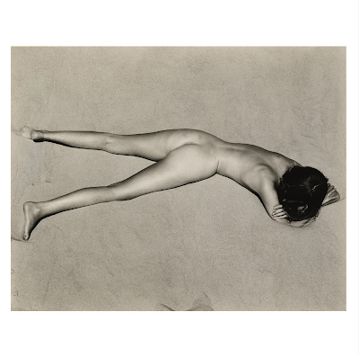
Edward Weston (1886-1958), ‘Nude on Sand, Oceano,’ 1936.
Christie's Auction Estimate: USD 70,000 – USD 100,000.
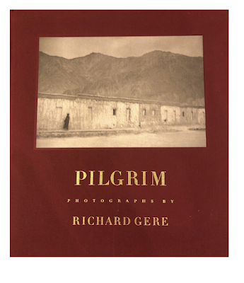
"Pilgrim", Zanskar, 1983 © Richard Gere
Courtesy Fahey/Klein Gallery, Los Angeles
"Richard Gere on Horse 1", Poundridge, 1993 © Herb Ritts.
Courtesy of Herb Ritts Foundation
(Pilgrim, Bulfinch Press)
In light of this auction, I'm reposting my indepth Interview with Richard Gere discussing his own photography, book and exhibitions, and his extensive photography collection:
Richard Gere, actor and human rights activist, is widely known for his leading roles in the Hollywood films; American Gigolo, An Officer and a Gentleman, Pretty Woman, or Primal Fear. He’s one of America’s most committed AIDS activists and a tireless promoter of human rights in Tibet, serving as Chairman of the International Campaign for Tibet. Gere was honored by the Tibet Fund for his thirty years of outstanding support of His Holiness the Dalai Lama and the Tibetan people’s struggle to preserve their identity and culture. He not as well known for his long-time involvement in photography.
I was first introduced to Richard’s photographs in the mid-1980’s; around the time his film Cotton Club, directed by Francis Ford Coppola, was released. Gere was an early collector of the then controversial artist, Joel-Peter Witkin, who was relatively “new” on the fine art photography scene at that time. While Richard was showing his collection of Witkin’s, I was distracted by a stack of 8×10 contact prints. I interrupted him asking, “Who took these? These photographs are really great!” He admitted reluctantly, they were his. I never forgot those images and they came to play an important role in future projects.
I spoke with Richard in New York about his photographs, his exhibitions and book, Pilgrim, and his extensive photography collection. We met in his Arts and Crafts Mission-style offices surrounded by a wealth of incredible photography starting with the entranceway lined with Ralph Eugene Meatyard photographs. Among his beautifully framed family photos and snapshots from various travels, are many more well-known images.
What is your family background?
My parents lived in the same town in Brooklyn, Pennsylvania, a very small town in northeastern Pennsylvania. Mother lived on the main street. I guess they would be considered one of the rich guys in town. Her father was involved with politics. I saw this plaque from FDR (President Franklin D. Roosevelt) thanking him for service on the draft board. He was the kind of guy that wore a suit all the time. I never met him, but in every picture he wears a suit and a hat.
My Grandfather Albert, my Dad’s dad, was a dairy farmer. He lived a dairy farmers life outside of town. He was in overalls all the time, working with the animals and milking the cows. So my parents were the country kid and the city girl, but the city was just this one street, one block.
The photograph of my Grandfather in his wheat field, on his land with the sheaths of wheat, is the logo of our Inn and Restaurant. It is about abundance, the abundance of the wheat that he was so proud of.
My mother is a quilter. She made beautiful, beautiful quilts; they really are to be treasured. You worked on her book of family quilts, so you know. She made clothes for all the kids growing up, and costumes for my plays; the Santa Claus costumes for the Santa Claus play I was in and The King and I, another play I did.
My parents were going to school at the University of Pennsylvania when I was born. They took snapshots all the time, books and books of black and white photographs. I remember when color started in the late fifties. There were a lot of photos in color, but not all of them. I’m still shooting black and white.
I remember loving a Brownie camera I had. A Brownie camera is a very simple machine. It was an intimate process – 127 film you had to wind yourself. I remember taking care of composing shots, whatever that meant as a kid. I remember taking shots in the Adirondacks. In a way, they presage the shots I might have taken in Dharamsala or Zanskar or wherever it may be, but it’s that sense of how do you balance the shape of that mountain against that cloud and where that tent is in the foreground. As a kid I remember a sense of questioning how do you balance these elements and make them feel right. I never particularly liked symmetry; I never liked things that were just straightforward. Let’s balance some heavier thing against some smaller things and just see how that creates a tension that has some innate drama to it. Tension creates drama internally in the picture; it’s internally in the viewer as well.
I got serious about my photography when I started working on my first book, in the sense of now I have to look at this in an even more focused way than I ever have before. I always liked and was careful about what I was doing.
You were one of the first people who ever saw my work. I just didn’t show it. Herb Ritts and I were very close friends. We had the same printer and we’d look at each other’s stuff, but this was something that was private to me. I cared about. It wasn’t necessary other people had an opinion, positive or negative, it wasn’t for them. I was pleasing myself. And as is true when pleasing yourself, you’re very tough. It’s very hard to fool yourself.
What was your first “serious” camera?
A Canon. Someone, a girlfriend gave me a Canon AE-1, which I still have. It had automatic aperture control. It was the first primitive version of an electronic aide to helping that process. I still use that camera.
I’m not a big cameraphile, as you know, I still use that same Contax T2. It’s very easy to carry; the Zeiss lens is brilliant – brilliant. It’s metering is extremely accurate, it gives the right kind of black saturation that I like a lot, and it gives a very accurate movement from light to shadow.
I don’t always have a camera with me, but certainly when I travel I do. I go to a lot of interesting places and I usually take a bunch of cameras, but the reality is it’s that T2 I get the shot with. In fact, that picture that I gave you of Cairo was taken with the T2. I was in this old Mosque and I just turned to my left and that shot was there. All the angles were right, all the lines were moving, everything was right. All I had to do was take a half step to my left. Everything lined up and I knew that was it. That was the shot. With that little T2 it can happen that quick.
That’s a very complicated photograph; the dark areas, light areas, white against black, black against white. It’s very complicated and that’s a very straight print. If that was printed in platinum and you got even more in the mid-range that would be incredible. But I think the 35 negative is just too small for a huge print of that. That’s the only downside. Cairo was a digital print made for me by John Paul Caponigro at his place up in Maine. He’s a very nice guy. He’s been printing for me for years.
“Cairo”, 2010 © Richard Gere. Courtesy of the Gere Foundation
What artists, if any, influenced you?
Look, everyone loves Vermeer. There’s no one who doesn’t love Vermeer and his use of light. It’s natural, it’s energetic, it’s sensual and utterly real, at the same time it’s unreal. It’s a peculiar thing he’s able to do. You see it sometimes in movies, usually in European films, that use of natural light. That’s my whole thing, natural light. I wouldn’t even know how to begin to do commercial photography.
The cinematographer on my film, Days Of Heaven, was Néstor Almendros. He won the 1979 Academy Award for Best Cinematography for that film. He was born in Spain, but his career started in Cuba. I liked him very much and we were good friends. He was working on this film which was crewed up essentially like a Hollywood film, albeit an alternative because it was made by a bunch of guys that weren’t part of the mainstream. But the crewing was pretty much like a normal American film.
Néstor was a very highly thought of DP (Director of Photography) and this was his first American film, shooting up in Canada. With a standard crew you have a lot of lighting guys, a lot of gaffers, a lot of people around the camera expected to do all kinds of things. Well, he didn’t want any of it. He was very polite, and he loved everyone, but all he wanted was a bounce card.
Essentially it’s just a piece of white cardboard you bounce a little bit of light on someone’s face and just play with it a little bit to fill in and create, back it off so you get a little shadow. Vermeer! You’re creating Vermeer, but just using the balance of a bounce card. There’s no extra light being brought in at all. He did 99% of the movie like that.
The worst light all day is eleven o’clock in the morning until two o’clock in the afternoon. It’s that down light that’s so ugly. Early morning light is great because it rakes across; late afternoon light is golden and rakes across. If you look at Days of Heaven, we were really getting it in those times, when the light is coming from the side. When you’re in a restaurant, you don’t want an overhead light. You like those nice lights that are just about face level, but it’s raking across. Again that’s Vermeer light. Vermeer didn’t have light coming straight down; it’s coming in a window, it’s coming from the side, right? That’s the same idea in movie films. You want it to have an angle that is creating a kind of sensual play with skin. I don’t know that I was studying that, but I could see what I liked. You don’t have to study painting to walk in and go, “That’s beautiful”. If you want to be able to create images or take advantage of images like that, capture them, you have to know how he did it. Where does that light come from?
I’m self-taught, so I’ve figured my own way of doing it. I don’t even know if I could have a technical discussion with a professional photographer that makes their life out of doing this because they have to talk to advertising people or someone else about these things. I just figured out how to do it the way I like it. That’s all it is. I’m maybe more like a folk artist than anything else. I’m not trained.
I haven’t thought about this in a long time, but when I started really playing with the AE-1 camera – I think it’s an f/2.8, which is fairly fast, not super slow, I was shooting a lot at night and using lamps trying to get that effect. Put it up high, put it down low, just out of the frame line and seeing what I had. Because I didn’t have any equipment, I was just taking a lamp and doing various things, building up on boxes or turning it over on it’s side in another direction, just to see what it would do on faces. Sometimes I would shoot and the bulb would be right there. I would just shoot on one side of the face with the bulb just outside of the frame line. You don’t really know until you get the contact sheet back what it meant. Obviously there wasn’t any digital stuff then so you could see right away. Around this kind of experimentation was the magical thing of getting the contact sheet back. What did this experimenting with light actually do to the film, with the intensity, the direction, and the balance? I was finding out.
Do you want to know the most profound thing anyone ever told me about photography? It was Helmut Newton. I remember Herb Ritts telling me this story. Herb had to start to really get into cameras because of the work he was doing. He had to be able to talk to people about it; how it was going to be used, what kind of resolution was required to make the covers; whatever it was. It wasn’t to please him; he was being hired to do a certain piece of work. Herb was talking to Helmut about some new camera and Helmut just shook his head at him and he said, ”Herb, the picture isn’t in the camera. The picture is here (pointing to his heart).” Bodhicitta.
Bodhicitta literally means the Mind of Enlightenment, but when you say Bodhicitta, you point to your heart. It’s the same thing with this. The photograph isn’t in the camera, it’s here, and it doesn’t matter if it’s in focus, if it’s not coming from the heart.
I think that’s true about everything. If you think about the early decades of Photography they’ve done it all already. It had already been done. Those first experimenters, those were the guys they invented the whole thing. I still look at those and go, “Holy shit, they’re doing it all.” I saw a portrait in a shop in Denver, Hal Gould’s Camera Obscura. Every time I go to Denver I go look in this place. One time he had an early salt print. It was an 1860’s portrait, not any bigger than a 35 mm contact print. It was one of the most beautiful things I’ve ever seen in my life, everything about it. I’m starting to tremble just thinking about it, if I could take a picture as good as that. They had no technical abilities; the lenses were lame, the printing ability was lame. It’s analogous with early blues recordings. The recording equipment was terrible, the microphones were terrible, and when you listen to them now there are cracks and pops all over the place; but because the music was coming from such a deep place, the technical aspect of it is meaningless. It transcends all that.
I brood about a cropping or the blacks not rich enough. I’ll get it maybe marginally more pleasing to me and in the end, I’ll say, “Yeah that’s a better print.” It doesn’t change the fact the photograph was the photograph. If it doesn’t have ‘it’, you can’t make it by doing a little better print, a little better crop. It’s there or it’s not basically.
I am playing more with color. I’m getting interested in it. I haven’t figured it out yet. I took some pictures of my son, Homer, that I thought were really great in color. That kind of pleased me. They don’t always come out, but a couple I took of him, I thought, “Wow, that wouldn’t happen in black and white. This is something else, this is something different.” John Paul made color prints for me with his ink-jet system. The colors were just “Wow!” They weren’t real, but they weren’t unreal. They weren’t like Kodacolor.
Where did you take the beautiful photograph of the wall (now called “Pilgrim”), in Ladakh?
That was taken in Zanskar. That’s an interesting picture I like a lot. I was getting feedback, not to me directly, but people said, “These things not even in focus, he doesn’t know what he’s doing.” But that’s what I liked. I liked the fact it wasn’t a tourist shot, it’s not pristine in that normal sense. There’s a certain expressionistic quality I do like in my photography. I don’t care if anyone else likes it. It’s just how I see things.
“Giza”, 2005 © Richard Gere. Courtesy of the Gere Foundation
Your photographs of the Pyramids and the South Pole are like two jewels. I’ve never seen a photograph of the Pyramids from that angle before.
I was in Cairo in 2005 on the way to the Middle East to meet His Holiness in Jordan, in the ancient stone-carved city of Petra. Elie Wiesel co-hosted “The Petra Conferences” with King Abdullah II of Jordan. They brought together Nobel Prize winners with distinguished social and political leaders. His Holiness was there and I was invited to come, but on the way there I was speaking at a conference of Arab women, “Women, Creativity, and Dissidence” in Cairo, Egypt, under the aegis of the Arab Women Solidarity Association (AWSA). I was there for a couple of days and I befriended one of the key archeologists. I asked to get to the Pyramids early in the morning. I got there in the morning at dark and waited for the light to come up. We were way out in the desert. I took a lot of pictures. Somehow it was out and around, way on another side, and I could see the Pyramids were almost lining up. When the light was coming up, all the lines were converging and I just had to move maybe ten or twenty yards over, then all these lines were lining up creating these planes. I’d never seen that angle in a photograph before either.
The South Pole is a standard silver photographic print, not an inkjet print. Usually I do quite a few proofs before I’m happy with it. As I recall, we didn’t have to labor it too much, it pretty much was there.
As Co-Founder and Chairman of Tibet House, New York in 1990, you created two Photography Portfolio’s that included 24 images donated by the top photographers in the world; Helmut Newton, Annie Leibovitz, Jerry Uelsmann, William Claxton, Mary Ellen Mark, Joel-Peter Witkin, are just a few I remember. How did that come about?
Bill Borden, a film producer friend of mine, and connected to the Tibetan master Kalu Rinpoche, did a lot of the organizing. We put together an amazing group of photographs to raise money for Tibet House. We called it ”The Year of Tibet” Portfolio. He knew the Magnum photographers; I knew Herb and the fashion guys, and some we didn’t know we just contacted. It was the first time I’d done something like that. A printer in L.A. made the platinum prints, then chased down all these photographers all over the world getting them to sign the prints.
I remember speaking to Sebastião Salgado. I said, “We want to do this for the Tibetans.” He was so sweet, he said, “Well you know I have this new book. Let me send the galleys and you can have any image you want.” I chose First Communion in Juazeiro do Norte. Brazil, 1981. He was known for the working guys in the mines in Brazil and this was quite different. It had an angelic quality I thought was really appropriate, and that became the front cover image.
When we started Tibet House, we didn’t know what we were doing. We were trying to figure it out. We didn’t know how to do anything really, but we really got it going. “The Year of Tibet”, which was a year-long International Festival, was a major milestone. There was a wonderful saturation of Tibet, especially in New York. His Holiness The Dalai Lama offered a Kalachakra Initiation at Madison Sq. Garden. After that, I decided I wanted to work with my own Foundation.
What is the Gere Foundation?
I started the Gere Foundation at that point and used it as the vehicle to help a lot of other organizations and projects. We were trying to raise money and we decided from the beginning we were going to do everything based on high quality. I don’t think we ever compromised that. Everything we ever did was of the highest quality we could possibly do. In keeping with that, you came to me one day when we were talking about fund raising and said, “Why don’t we sell some of your photographs?” And we did. The first project we did to raise money for the new Foundation were two Photography Portfolio’s, Zanskar and Tibet, of my photographs, the net proceeds from the sale of these Portfolios and individual photographs, went to not-for-profit organizations to support Tibetan interests. I have never kept any of the money that’s coming from these. To this day, all the money goes to the Foundation, which goes towards Tibetan projects.
You were a big champion of these photographs. No one had seen this stuff. And I was quite reluctant as I recall. First of all I wasn’t sure that anyone would care about them. Second, they were very personal to me. I didn’t know how I felt about them being in the marketplace. I still have a funny feeling about that. But there were a lot of photographs that I felt OK about and you felt strongly about. This was your world; you were in photographic publishing and had created portfolios for Richard Avedon and knew how to do that. You knew what you were doing, so you said, “Look, let me take a run at this and let’s see what we can do.”
I don’t remember why we ended up with two portfolios, Zanskar and Tibet. I think it was not conceptually, but emotionally they were two different types of photographs. It was essentially “in Tibet” and “out of Tibet”. The ones out of Tibet were Zanskar. In any event, Zanskar’s in India and they were taken in a free environment. It was a people, a culture, and poor to be sure, but free. It had a different feeling to it. I took different pictures there.
When I went to Tibet, in 1993, which is the only time I was allowed in, or have been allowed in, I took very different pictures. They were denser and more Goyaesque, and for good reason; it’s an oppressed, suffering place on many levels. That sense of freedom and ease that I’d found in Zanskar, was quite different there – especially the pictures taken in and around Lhasa. It didn’t feel appropriate taking the romantic pictures of Tibetan’s there. I didn’t have to force it, those were the images that were there, but also comes from the technique I was using shooting. I shoot handheld, I shoot extremely low light, I shoot for the most part with camera’s that are not exceptionally fast, so there’s going to be some movement in the images. Sometimes that lens can be open three seconds and I’m hand holding it. Now a lot gets in in three seconds, two seconds, even one second. A lot of stuff gets in that is not just light, it’s emotions that get in.
Very fast aperture time, shutter time – Snap! You’re not getting that much in, there’s no time for it all to get in. But I like this thing where it’s open for a long time, and it’s part of why there’s slightly wonky focus in my shots, because I’m hand holding for seconds. The shot is there.
There are usually three shots. If it’s a difficult light situation like this where the shutters going to be open one, two, three seconds – from my own experience of my work, one of those three is going to be the one I want. It’s not always that one is sharper than another; whatever it is, one’s going to feel right to me if I do three of them. Sometimes it’s so dark, I can’t even see it, and I’m just sensing that there’s something there. There’s one in particular I took in a Monastery. It’s these two angels that are hovering there. (Angels, Shekar Monastery, Tibet, 1993) I could barely see anything when I took that shot, but I knew that the shot was there and I knew I had to take it “now.”
I still remember taking that shot with the T2. There’s something about the T2; you can be very non-intimidating with that camera in almost every situation. I remember I was over at David Hockney’s studio and we were talking about camera’s. He had this little camera he pulled out, I don’t remember what it was, but he put a Daffy Duck decal on it. I started laughing because I knew exactly why. It made it look like it was a toy and it took all the intimidation factor out of it.
Your first two exhibitions I worked on were well received, beginning with the The Menil Collection in Houston under the auspices of their founding Director, the late Walter Hopps.
I was well aware – I was extremely humble in the fact that a Museum of that quality wanted to show my work. I certainly didn’t feel that I had earned it; I didn’t feel it was appropriate for me, but if this was going to help the Tibetans in some way, I was happy to do it. It was organized in such a way that His Holiness the Dalai Lama was in Houston at that same time. He was actually there on the opening day of the exhibition, so there was the extraordinary pleasure of being able to walk through the exhibit with His Holiness.
He called me over at one point away from the Press and gestured for me to come closer. He looked around to make sure no one was looking and pointed to one of the more blurred photographs and whispered, “Very bad quality! Blurry, blurry. What’s wrong, it’s blurry?” I tried to explain that was what I intended to do with it. This is a discussion he and I still have to this day. We were down in Atlanta on a panel on Creativity and I told this story. He still doesn’t understand this thing of slightly soft focus, kind of Goyaesque things. His way is sharp, colorful, and straightforward.
The two Portfolio’s, Zanskar and Tibet, were printed using a silver based emulsion, hand-coated on archival Arches cold pressed water color paper and then selenium toned. Although part of an edition, each print was unique because of the variable in the manual coating technique. It had to be done quickly and it’s different every time. A lot were thrown out; you can’t foretell exactly what’s going to happen, it’s a very erratic process. It had a real homemade quality about it, which I really liked. Each print was totally unique, so each one had a kind of quality of a Zen painter. The two exhibitions were made up of these prints.
The exhibition at the Robert Miller Gallery followed the Menil. The best thing about the one at the Robert Miller Gallery is I met my wife there on the opening night of that show, Robert Miller was also very kind, very generous, and it was a nice show. I was very pleased. And again it was a show of these very elaborate Zen-like prints.
There were other things I wanted to do with the prints. I wanted to work with platinum. The prints I was responding to were platinum. The richness of those mid-tones is just incredible.
What could you tell about your book entitled Pilgrim?
At some point some photographic publishers came to me and asked if I wanted to do a book. I hadn’t really thought about it before. I started to think, maybe this is another way I could help the Tibetans. I like this process of showing my work and people responding to it. I started to embrace that part of it. So I made a deal and began a collaboration with Bulfinch. (Pilgrim, Bulfinch Press, 1997)
I was trying to figure out what the book was. You were there for this process. Not every picture I’ve taken was about Tibetans. The choice was – if I’m going to do this, maybe it should be about a broader spectrum of interests and images. I thought no. I think I want to do one now that I’m able to put 80 to 100 images, my vision of my Tibetan experience.
I had quite a large photographic book collection at that point and there were some books in particular I really liked. One was a Stieglitz book, Alfred Stieglitz: Photographs and Writings (Callaway Editions, 1983), still today one of the most beautifully printed and designed photographic books. I started to look more and more into how to make a beautiful book, what kind of paper, what kind of printing. The paper I wanted to use didn’t exist anymore, so we had to actually search out a mill that would make paper that would approximate the paper in the Stieglitz book I liked so much. It was thicker and denser and would really soak up the ink. You couldn’t see through it so there was no ghosting behind the page. And I wanted a stark presentation of the images; I only wanted one image as you turn the page, I didn’t want images facing each other. I started looking into the printing processes. The book is all in Quadratone. There are four negatives for every image. And we doubled the blacks, so we had two negatives that were printing blacks and the others were the mid-tones and the lighter tones. We would shift sometimes if we wanted to emphasize the mid-tones or highlights.
Going back a little bit, when I printed these up as pure photographs, I had 4 different printers. Each one was good at something else; one was really good at blacks, one was really good at mid-tones, one was good at getting contrast. Each one just had a different feel and as I started to work with each one, I knew which images would be best for them and then I would work with them individually on those images. It’s a really complicated process. I felt I had to be directing the process and work in a very collaborative way with the printers. These guys were great, really great artists. Once I got those that I liked, we used them as the basis for how we were going to do the printing for the book. We would make decisions based on color densities, print by print.
I love taking pictures. I love getting the contact sheet back and getting excited about seeing something that worked; but to me, this was a calling card to talk about Tibet in another way. It was something I could give people, that they could take home, that they could live with. It meant a lot to me that Madeleine Albright kept this book on her coffee table in the State Department; Kofi Annan had it on his coffee table – that meant a lot to me. The care I took in writing what I wrote in the book, I also wanted to share. It was part of the same thing to me. It still is.
Who was the first fine art photographer you collected?
It was František Drtikol. I have some beautiful Drtikol’s I still look at all the time. The best of Drtikol is really, really good.
I collected all the usual suspects, I was all over the place; Cartier-Bresson, Diane Arbus, Manuel Álvarez Bravo, Harry Callahan, August Sander, Laura Gilpin. Irving Penn is still someone who dazzles me, it’s arresting almost everything he did is arresting. Edward Weston; I loved the late 19th century, early 20th century photographers. I have some Julia Margaret Cameron’s. I don’t know if technically she knew what she was doing or not, I have no idea, but it’s like she could capture something that was alive and breathing and esthetically beautiful. The best of those prints you just want to eat. The best of Stieglitz and Steichen I still find very moving. The quality of their prints is amazing – Steichen especially – just amazing, amazing quality; Robert Frank – his pictures look so simple, are just so deep and dense.
Josef Sudek still knocks me out. He’s not afraid to shoot in very low light, prints very black. His oil prints are some of the most unique things in the history of photography. Remember we were looking at a book of his (Sudek: by Sonja Bullaty) when I was thinking of another book I wanted to make? They were of oil prints and everything is black. Usually there’s white around where the print is set on the paper, the whole thing is black. I don’t know what the process is, but it’s called an oil print.
William Clift, his musician photos especially. Horst has done some beautiful things and also his attention to his prints. I bought a lot of platinum prints of his at one point, just beautifully done. Lewis Hines, I don’t think I ever bought any of Lewis Hines work, but there was something early on I really liked about it. It was always so emotional; there’s a sense of drama about it. Gustave Le Gray is someone I’ve always liked; he had a painter’s sense.
I bought a lot of Sally Mann. Again she’s another one whose prints are gorgeous. A lot of Man Ray’s and Mapplethorpe. He obviously knew the history of photography. You can see it in almost every one of his photographs – the entire history of photography, very finicky about his prints. Beautiful stuff. Duane Michals, I still like his work. There’s a sense of vision and humor and there’s a homemade quality about them. Humility. I like Paul Outerbridge. There’s a lot to learn from Paul Outerbridge. Paul Strand. Paul I like a lot; again, his platinum prints. The richness of the blacks in Strand’s work – very mature sense of camera, images and people.
Ralph Meatyard was a real influence on me. Someone I really burrowed in on. There’s a quiet melancholy in his work. I guess in some way it reminded me of this place where my mother and father came from; the old barns and broken things, kids with dirty faces, mysteries and ghosts, farm land, seasons, change, reflections…mirrors.
Joel-Peter Witkin had a very painterly vision. A lot of art historical references, but pushing the limit in terms of acceptability, but again he’s made the most gorgeous prints. Most all of his images seem to exist in a Bardo, kind of floating between life and death, dream images. Shocking. Some of them are still very shocking, a little harder for me to live with now. [“You had them everywhere. Everywhere!”] He was doing things you absolutely should not be doing. You shouldn’t take pictures of that! There was a fearless quality about him, but also a fuck-you quality about him filtered through a kind of visionary sense, which appealed to me. When I first saw them they weren’t in the auctions. They were real underground stuff. Jack Woody published a lot of that in Twin Palms. He would find these off beat artists. He resurrected quite a few people, so you were able to see them in a different way.
You’ve got to understand, photography was very inexpensive when I started doing this. I was making movies, so it would have been the late seventies. It’s when the auctions just started. We were buying really great things for just a couple of hundred bucks – which are now a couple of hundred thousand bucks. It was probably Herb Ritts that invited me to the first auction I went to. At the big auctions the qualities are so high, it’s a Museum show. You could see so many different things at these auctions.
We would go and we started building collections. There’s something about buying something that makes you look at it deeper, because you’re making a choice, “Do I want to spend my money on this? Am I going to live with this?” And so you end up really looking at something and comparing them. You start to notice the difference between this print and that print, “Oh, that’s a silver print and that’s platinum. That’s why you’re getting the mid-tones in that platinum print, that’s why that’s looking different. And a salt-print – why is it doing that, and how that makes you feel different looking at it.”
I stopped collecting anything years ago. I still like going to the auctions; it’s the range. I just like seeing so many different things. And because there are different photographers, every time you see an image, you’re woken up: “Oh, there’s a different point of view in the Universe”.
+ + +
Many thanks to Richard Gere and
The Eye of Photography's Jean-Jacques Naudet
(Interview from The Eye of Photography- March 2011)
 Joel-Peter Witkin and Son, Albuquerque 1988
 “Witkin is a photographer who has been mistaken for a grave robber, whose works were described by Marina Isola as “Part Hieronymus Bosch, part ‘Texas Chainsaw Massacre.’" – Cindra Wilson, Salon.com







 Posts
Posts

